
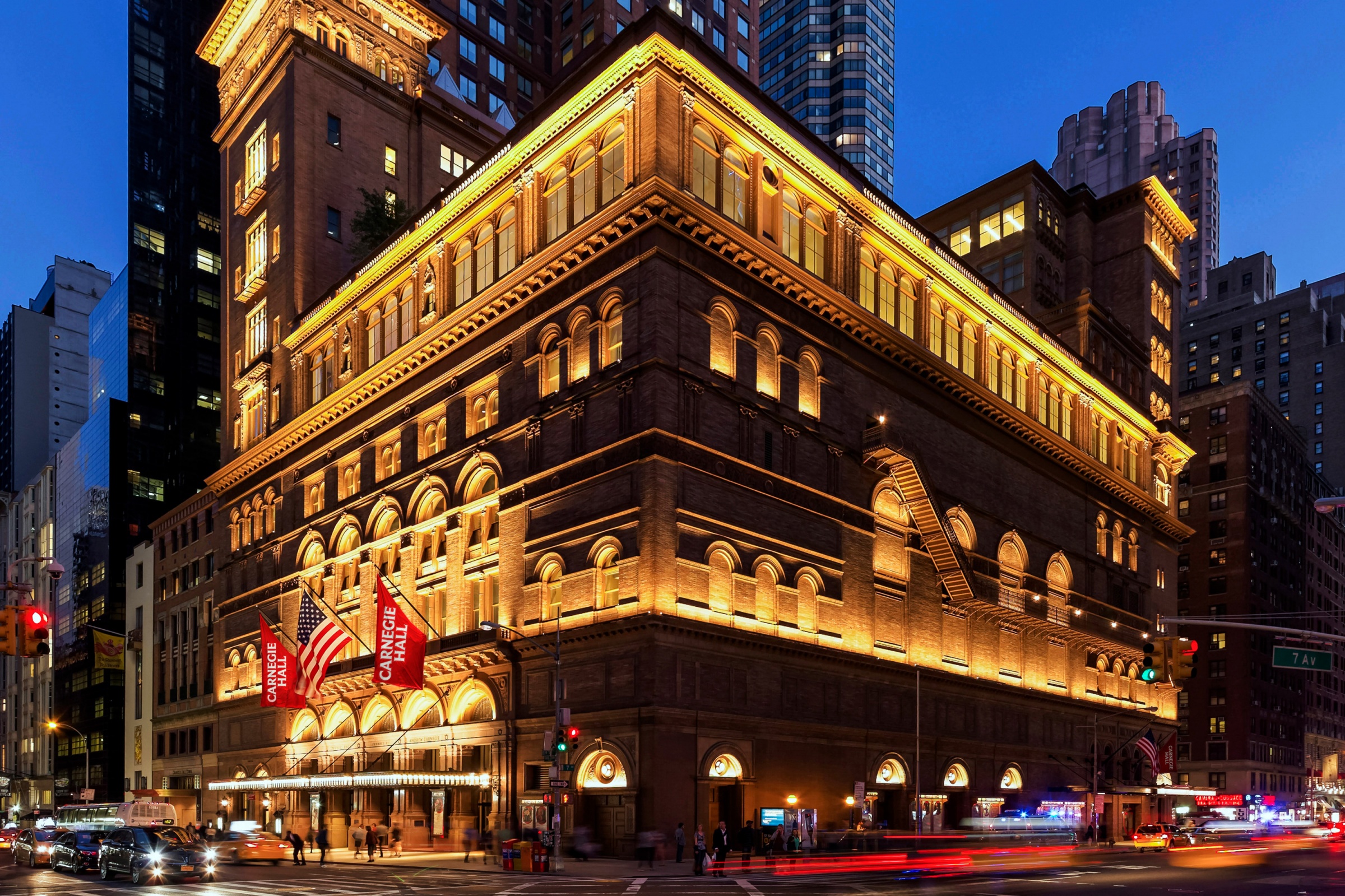
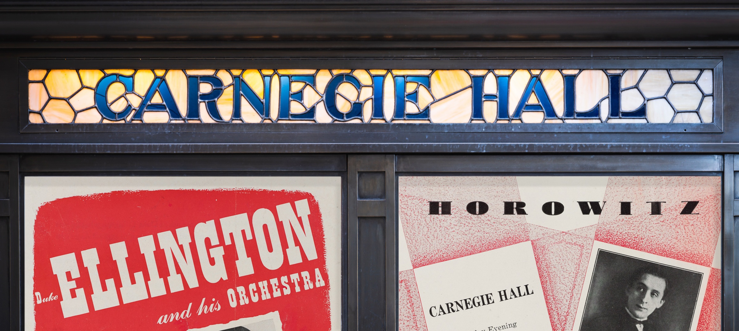
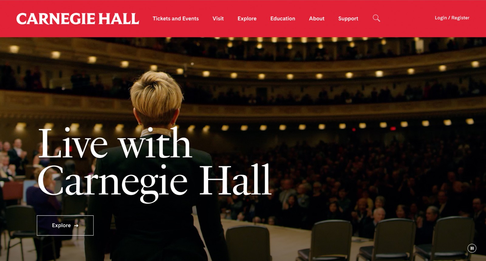
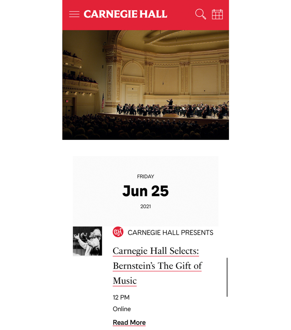
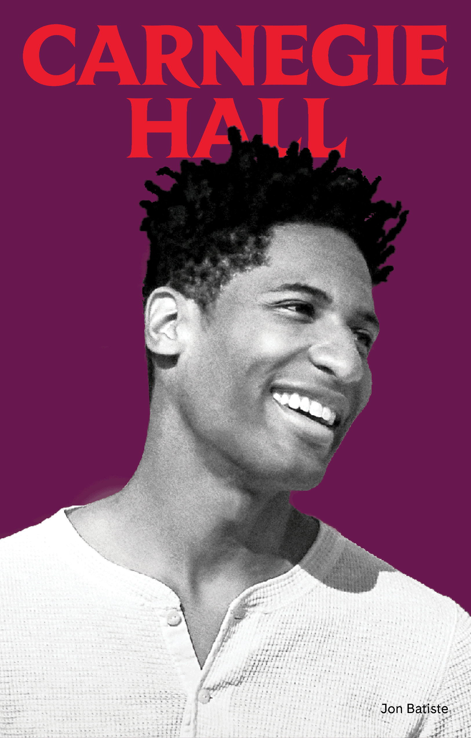
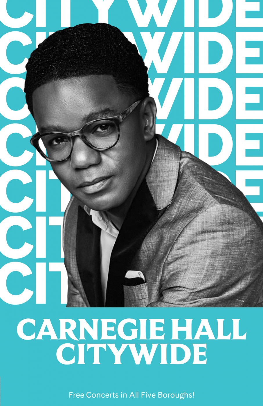
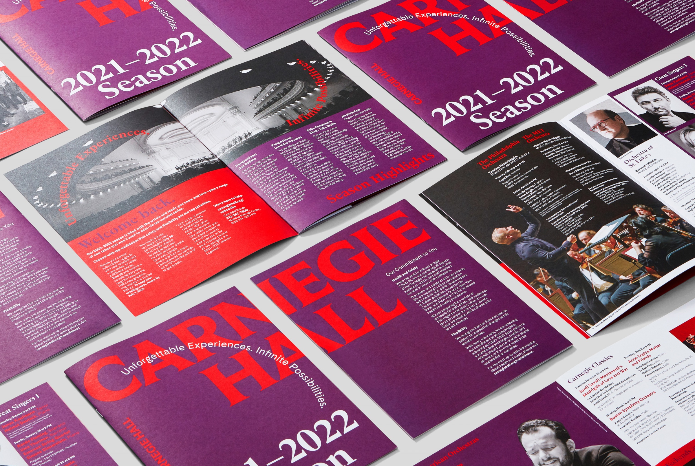
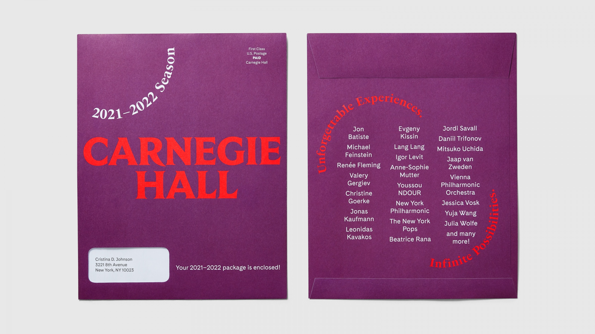
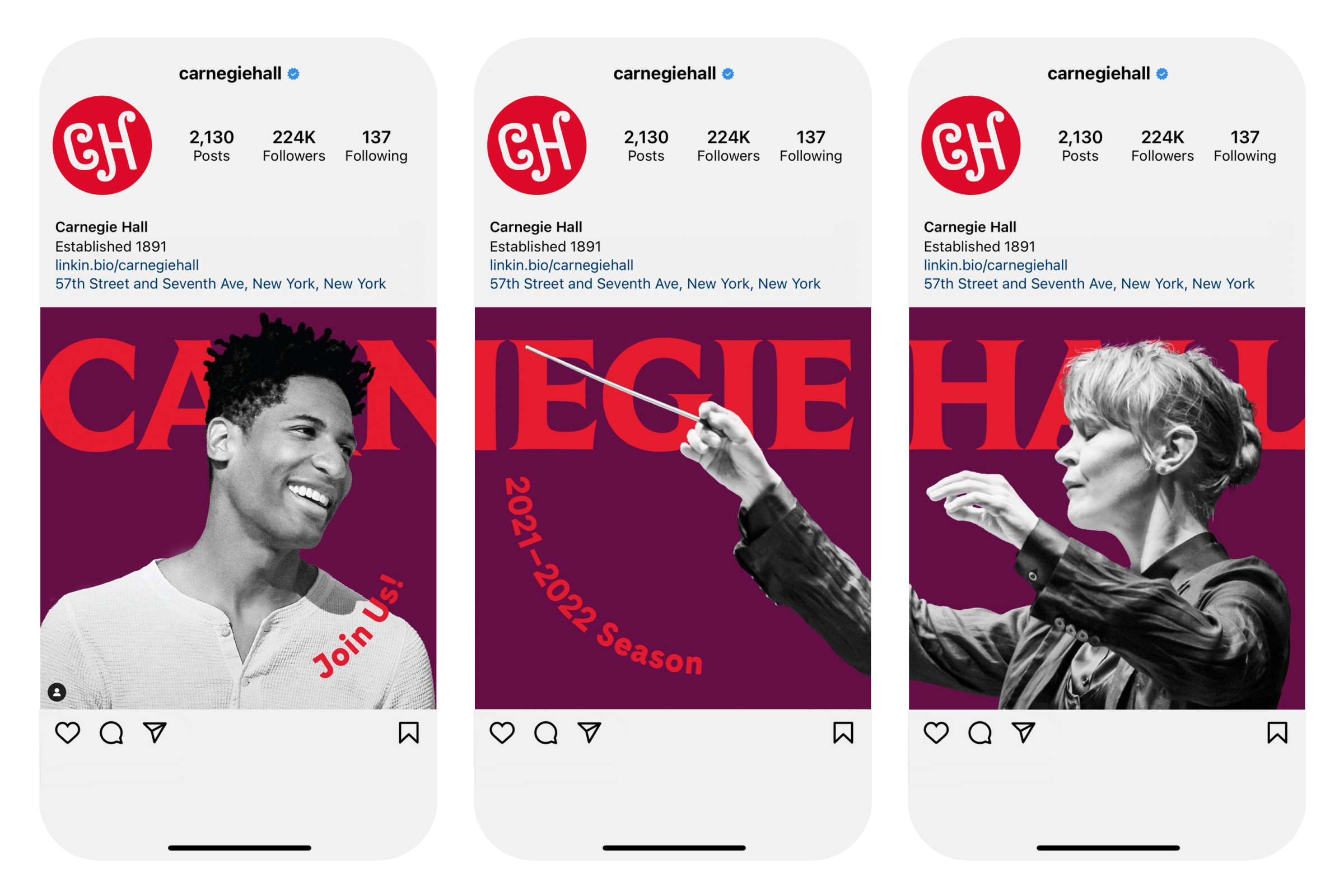
Carnegie Hall
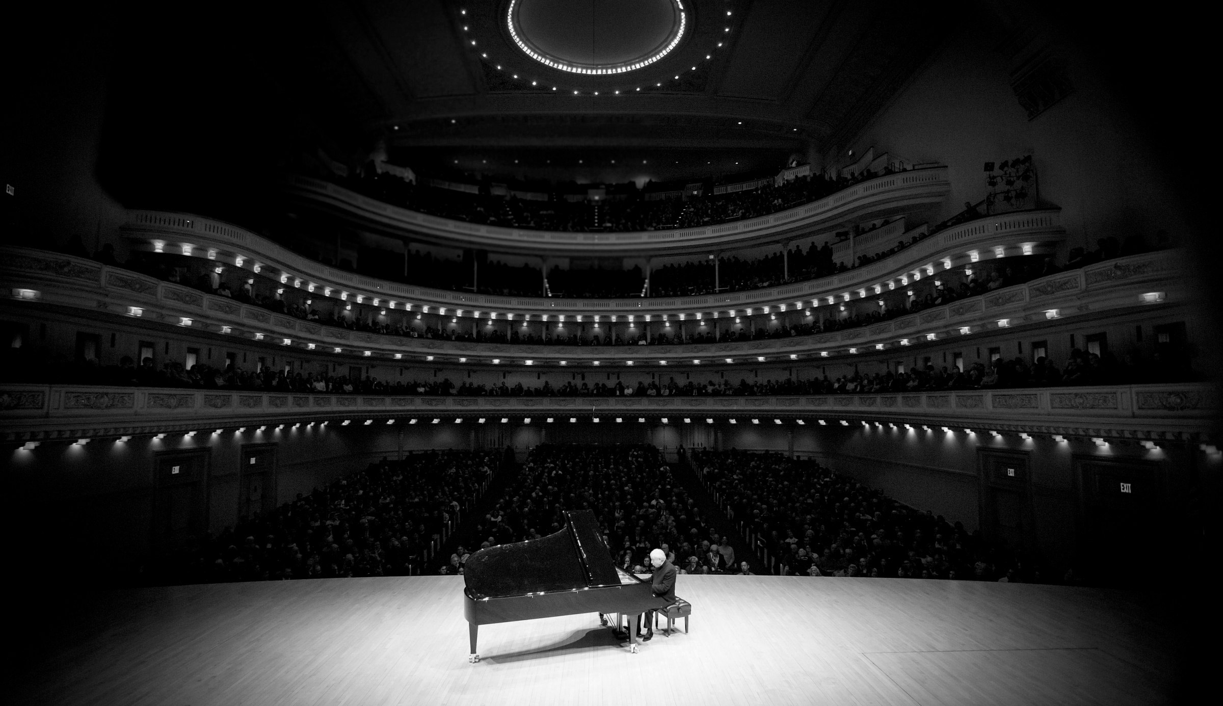
The transformative power of music.
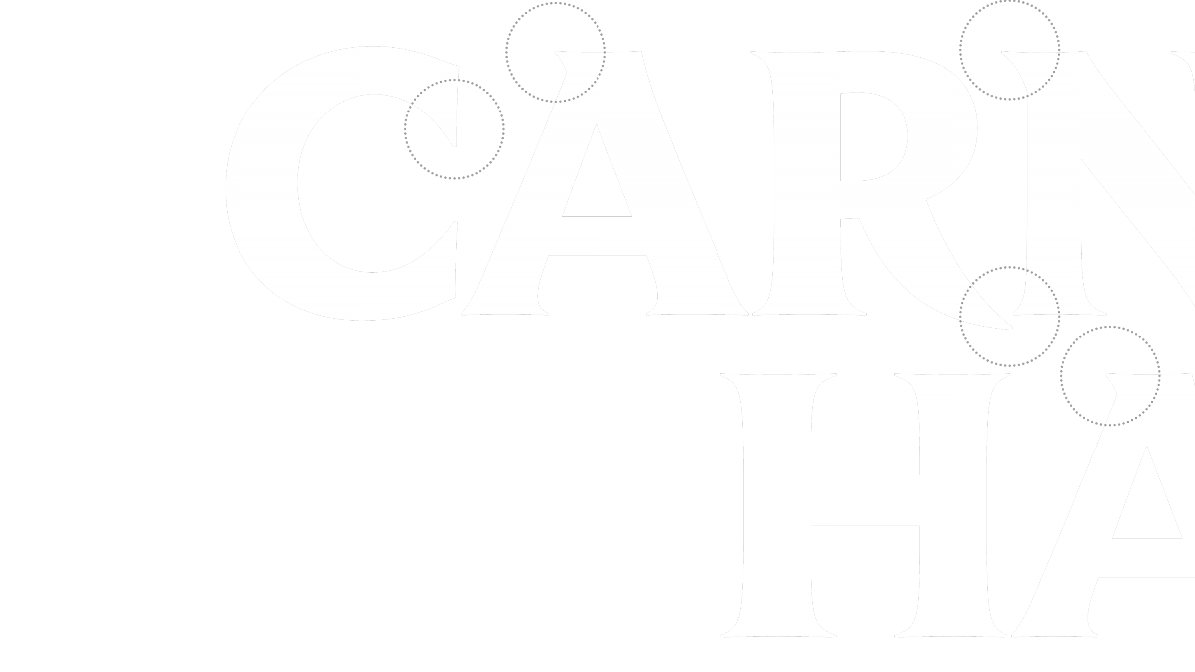
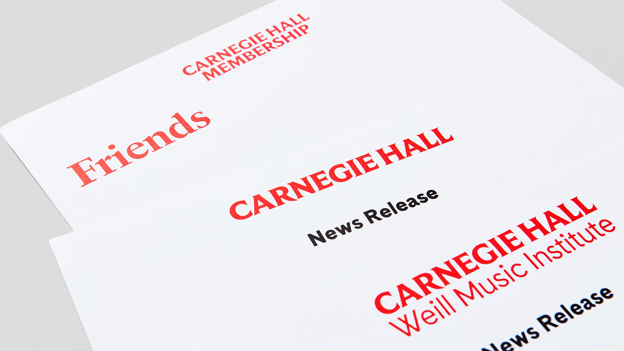
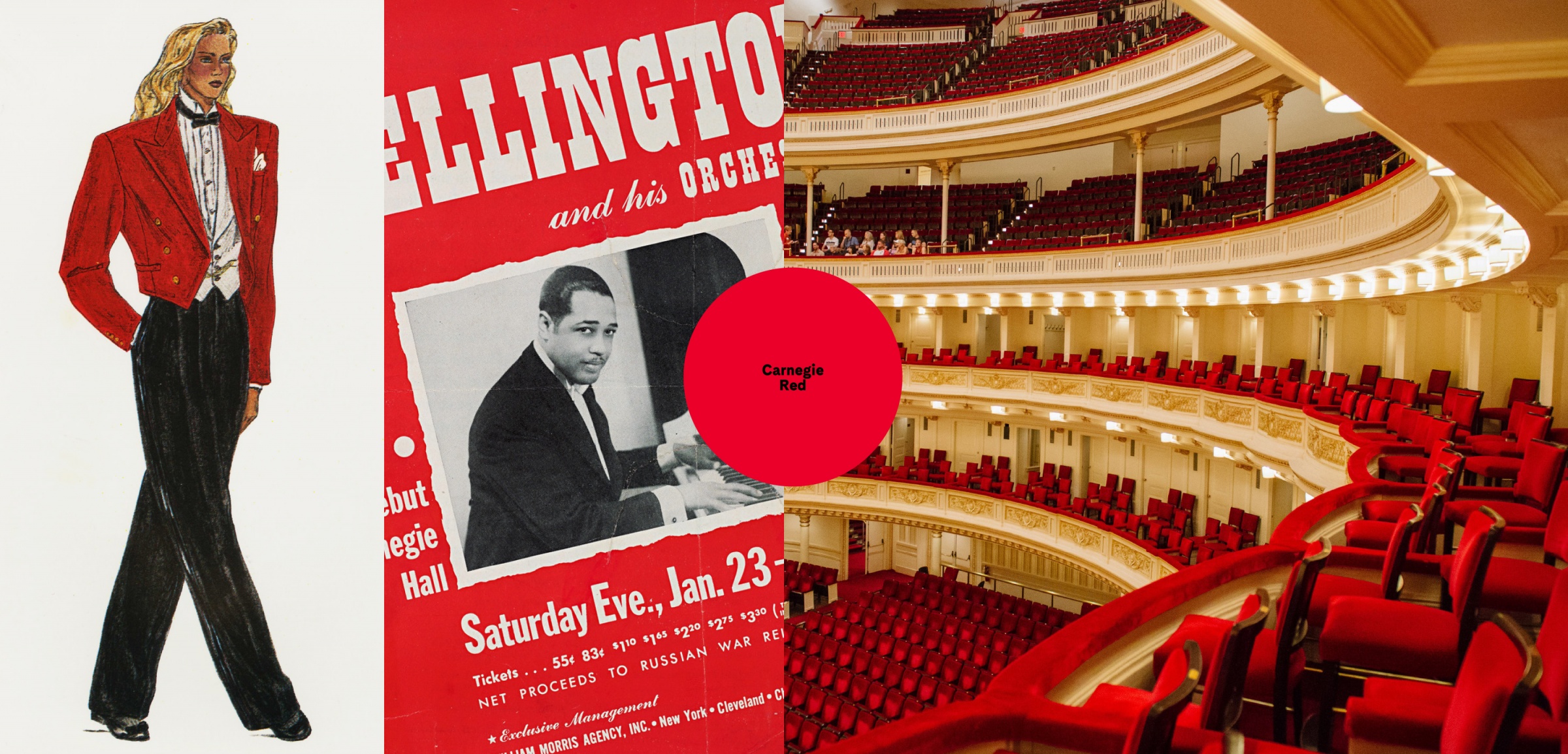
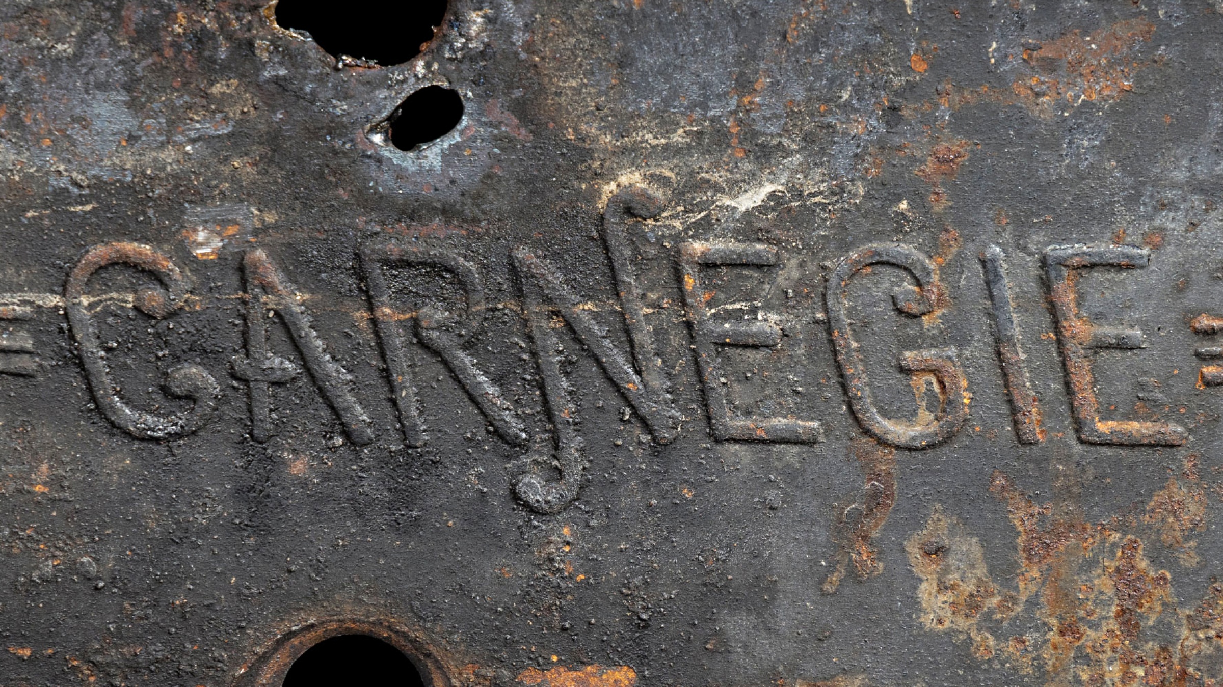
Champions worked with Frere-Jones Type to create a wordmark that incorporates the distinctive features of the poster case lettering and is also optimized for present-day needs.
C – Upper terminal extends into negative space created by the diagonals of the A and the terminals share a common angle.
A – The apex serif is softened, crossbar lowered, and outer serifs are shortened to create a more even overall color.
R – The leg descends below the baseline, and the serif is trimmed to allow for a better relationship with the following letterform.


Jennifer Kinon,
Bobby C. Martin Jr.
Partners, Champions Design
Michael McCaughley
Design Director
Carina Sandoval
Lead Strategist
Taylor Hale
Designer
Haley Kattner Allen
Project Manager
Zipeng Zhu
Motion Design
Frere-Jones Type: Fred Shallcrass,
XYZ Type: Jesse Ragan
Lettering
Nina Carter
Illustration
Ready Set Rocket
Website Design
Adobe XD
Guidelines
Carnegie Hall Marketing
and Creative Services
In-house teams