
Quad
From the Midwest to the world

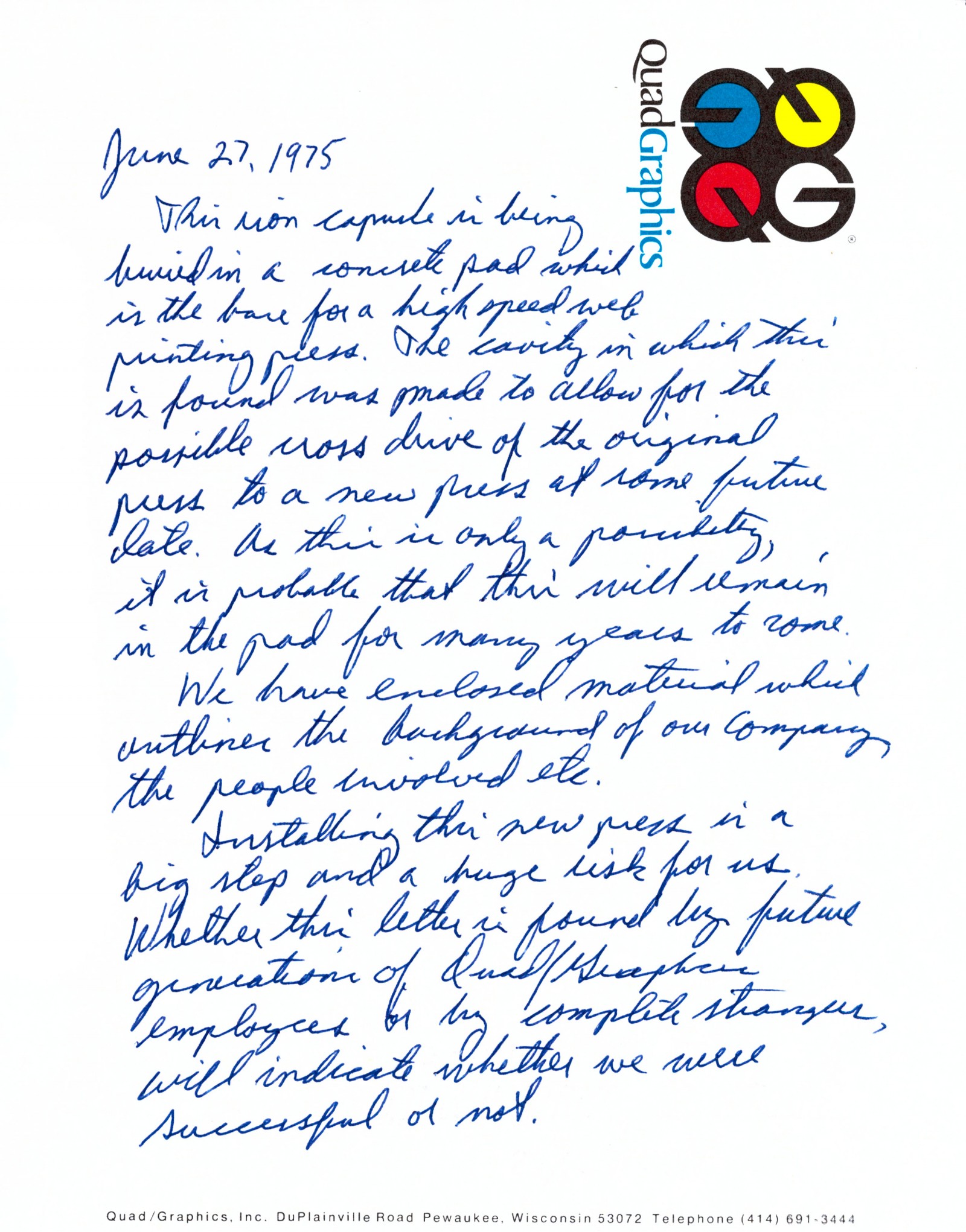
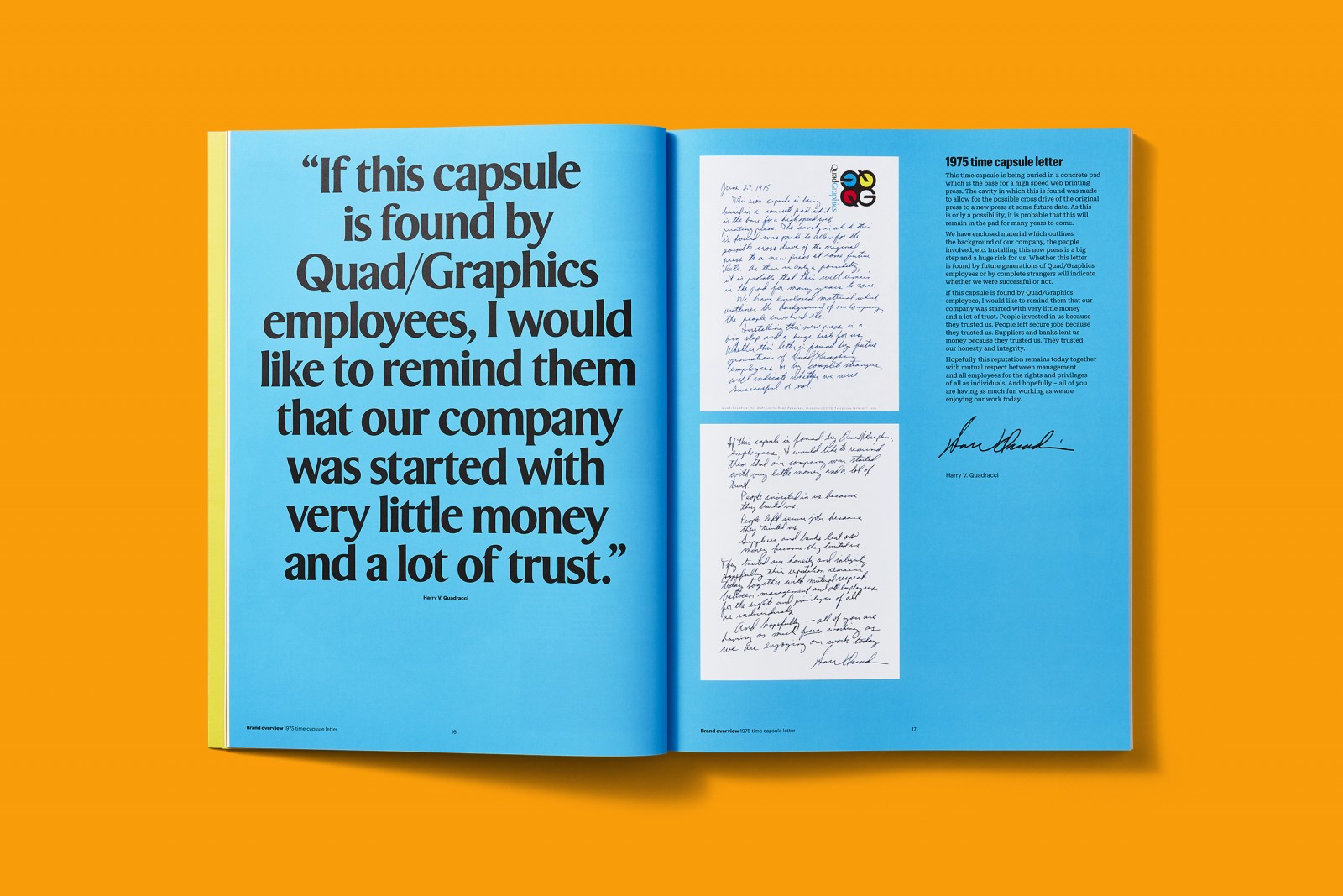
[Transcript] June 27, 1975
This time capsule is being buried in a concrete pad which is the base for a high speed web printing press. The cavity in which this is found was made to allow for the possible cross drive of the original press to a new press at some future date.
As this is only a possibility, it is probable that this will remain in the pad for many years to come. We have enclosed material which outlines the background of our company, the people involved, etc.
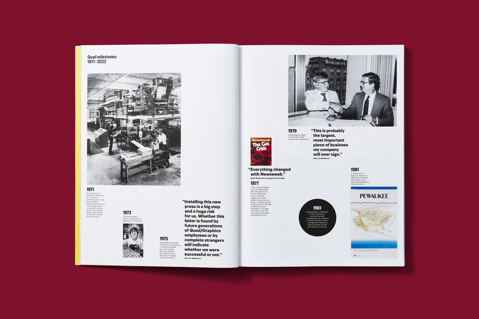
Installing this new press is a big step and a huge risk for us. Whether this letter is found by future generations of Quad/Graphics employees or by complete strangers will indicate whether we were successful or not.
Author: Harry Quadracci
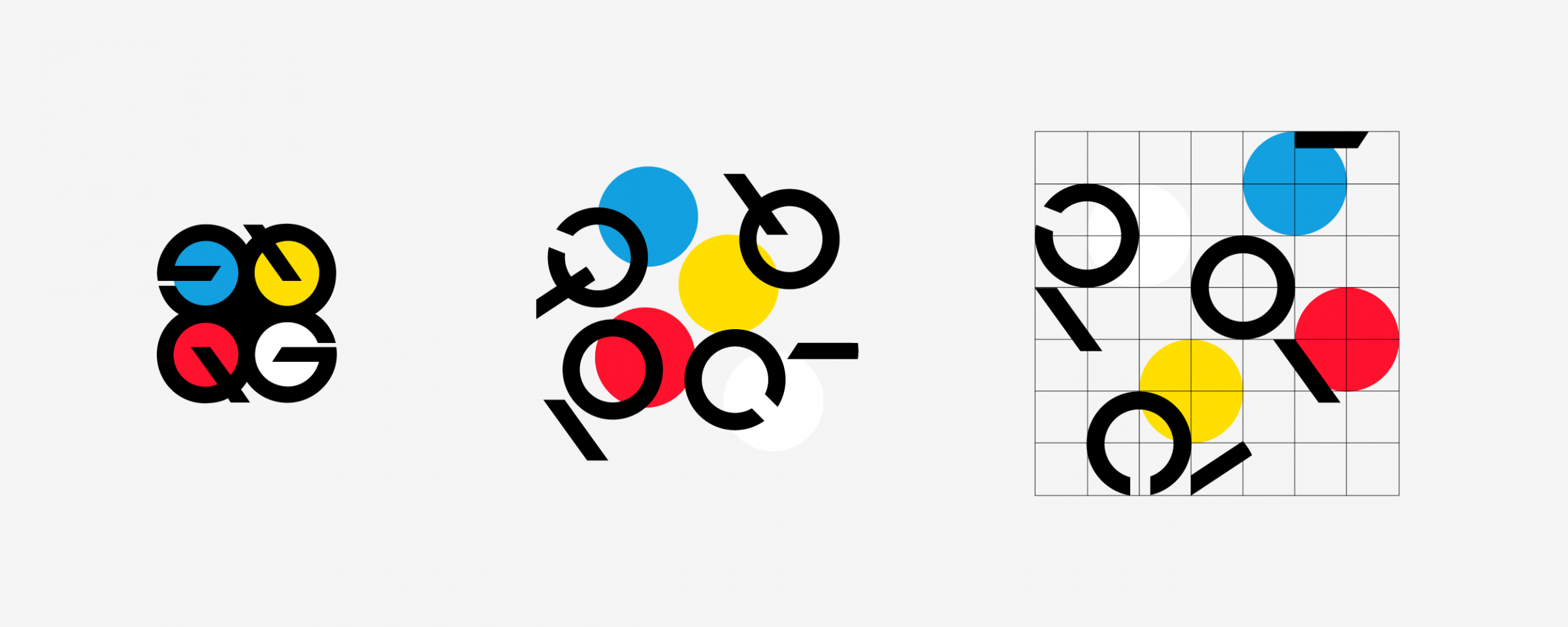
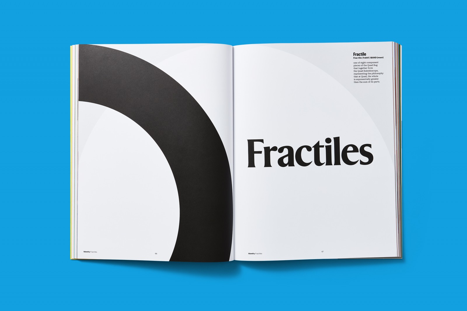
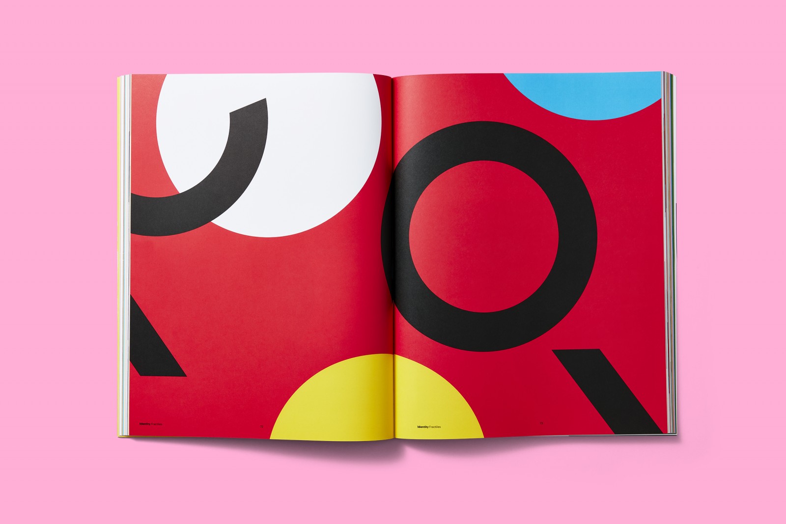
Fractiles
Each individual contributes equally to the success of the company.


Type
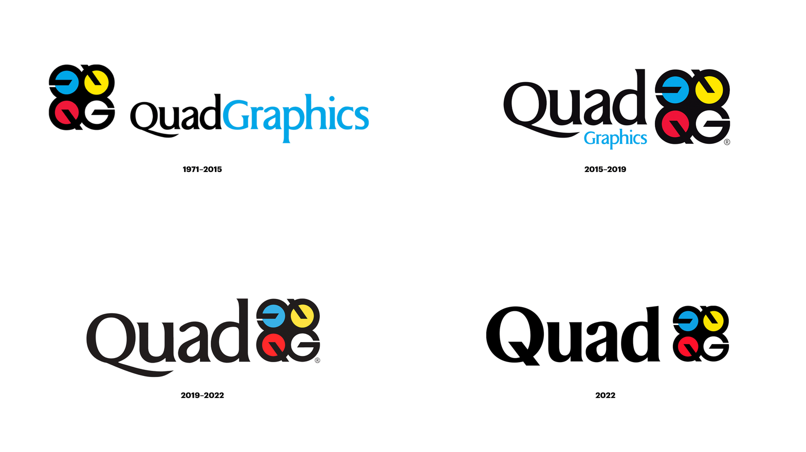
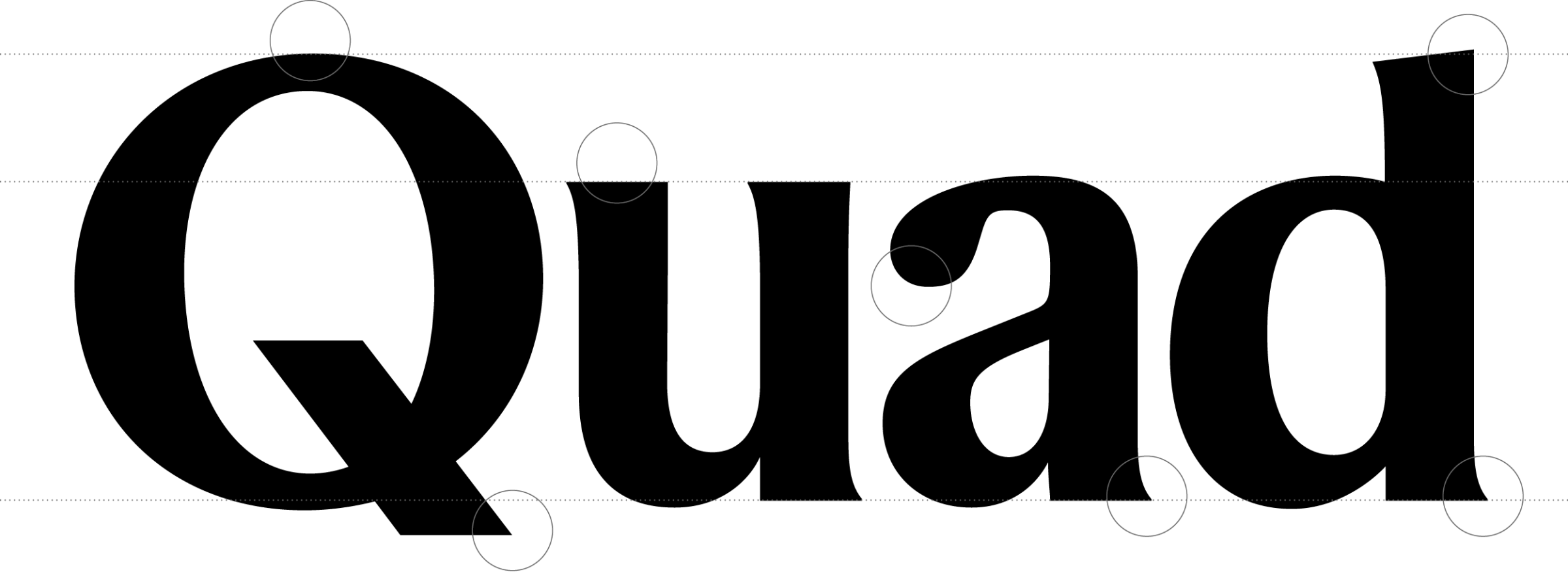
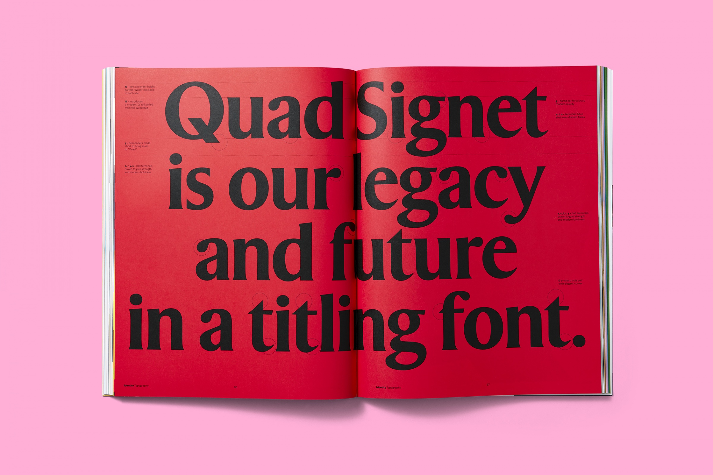
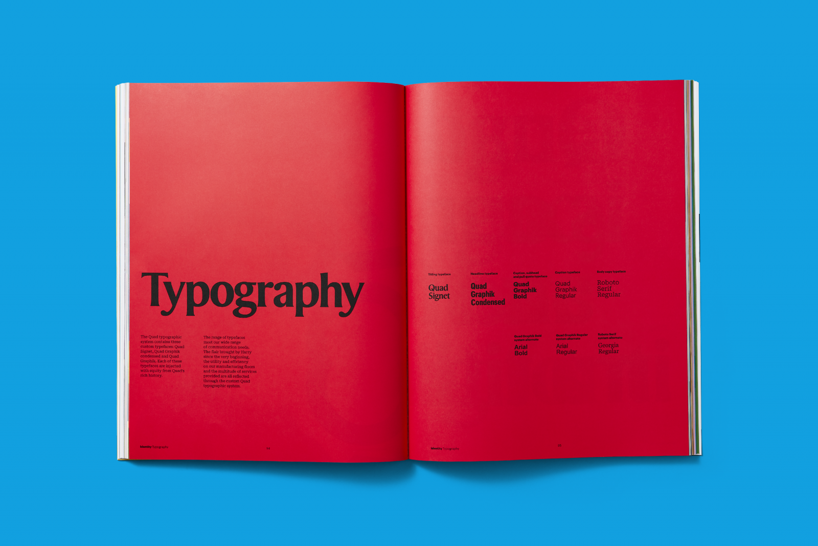
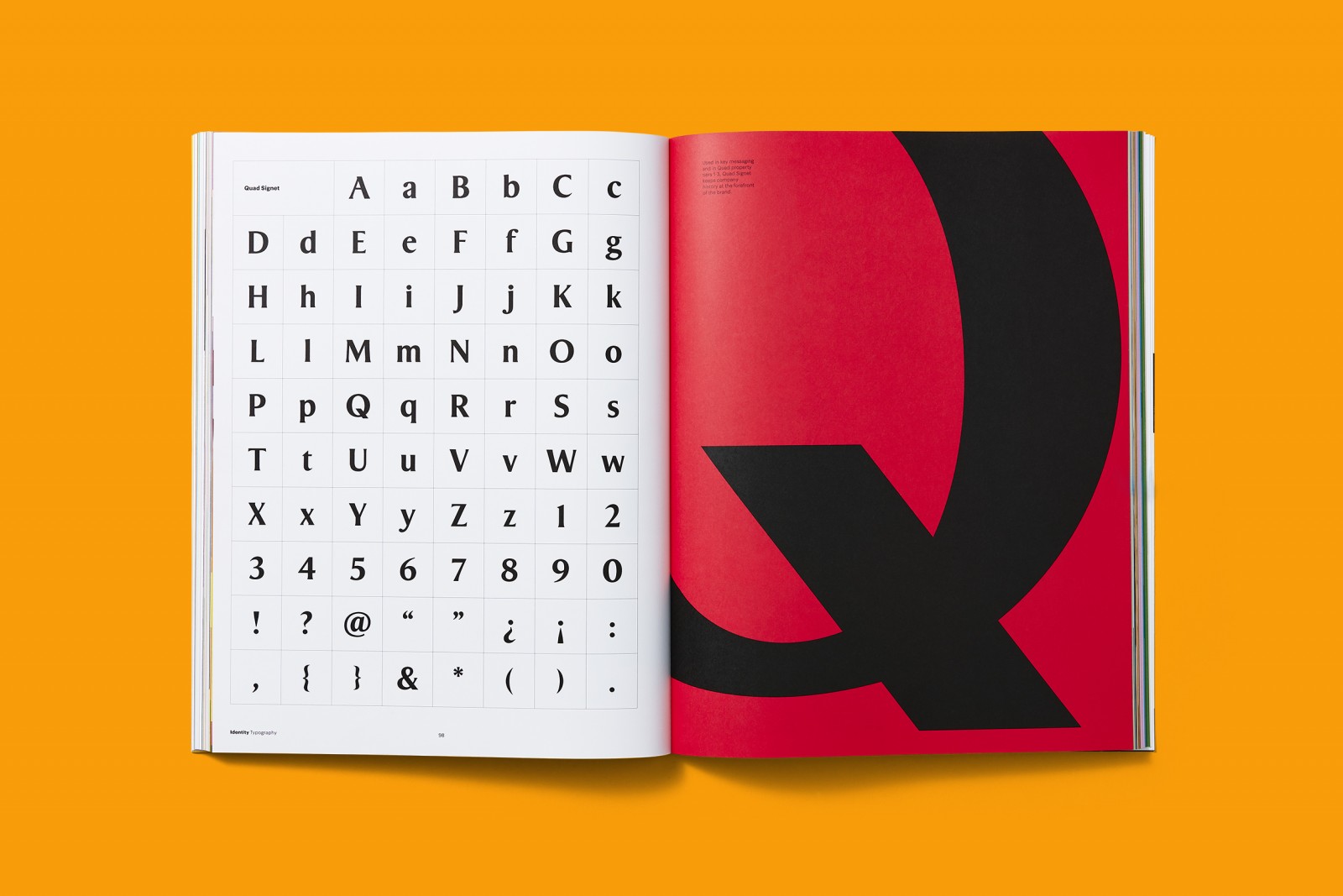
Quad Signet plus Quad Graphik Condensed, Quad Graphik Bold, and a new symbols font were all redrawn to sync with the Bug.

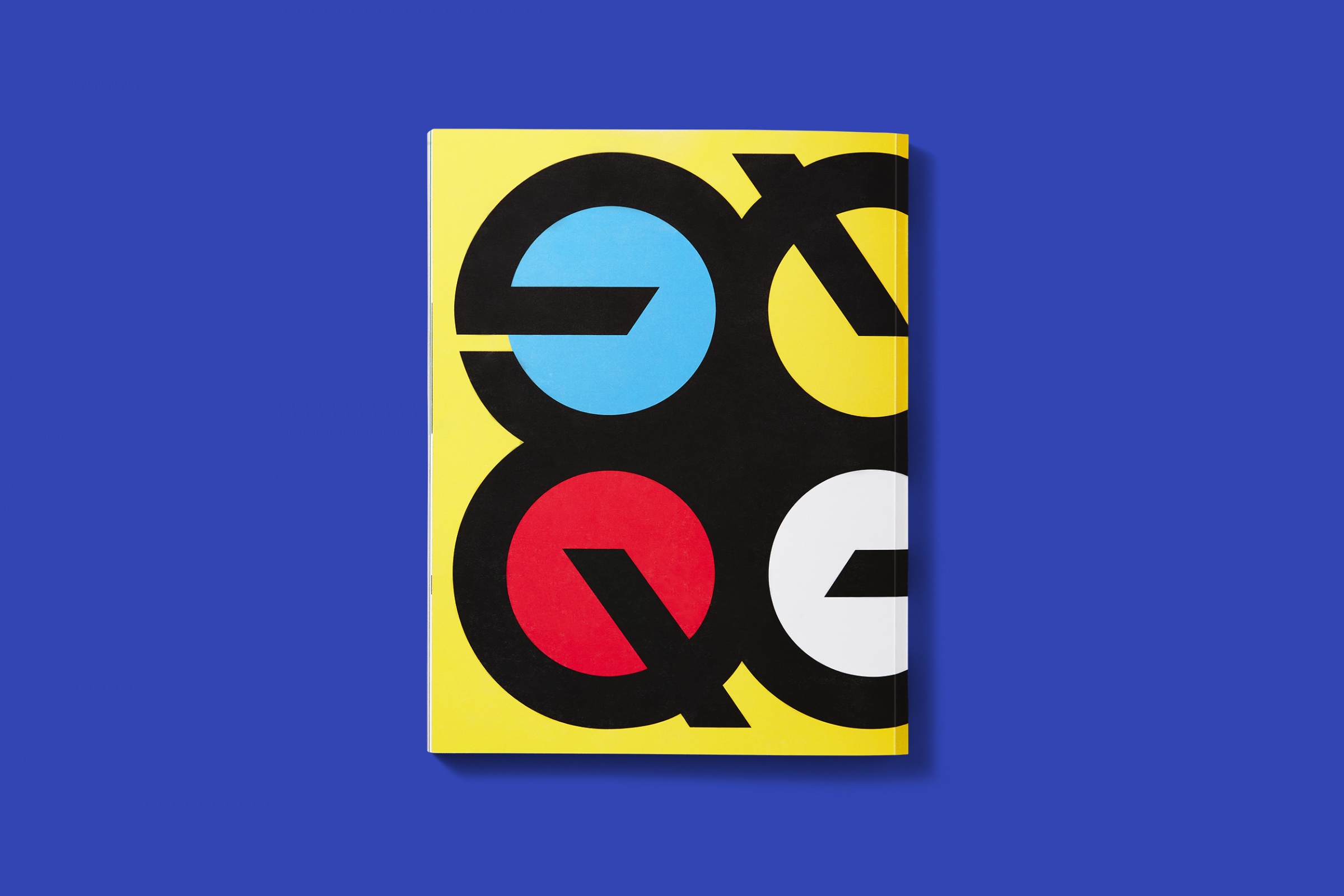
Q - The weight of the mark is bolder, and it introduces a new ‘Q’ tail pulled from the Quad Bug. It increases the scale of the name ‘Quad’ by shortening the ascender of the ‘d’ and making the ‘Q’ bigger.
u - A more compressed ‘u’ drawn to balance out the wordmark.
a - Ball terminals drawn to give strength and modern boldness.
a, d - Terminals have their own distinct flairs.
d - The x-height is increased while the ascenders and descenders are abbreviated to give the four letters in Quad a gravitas of scale.
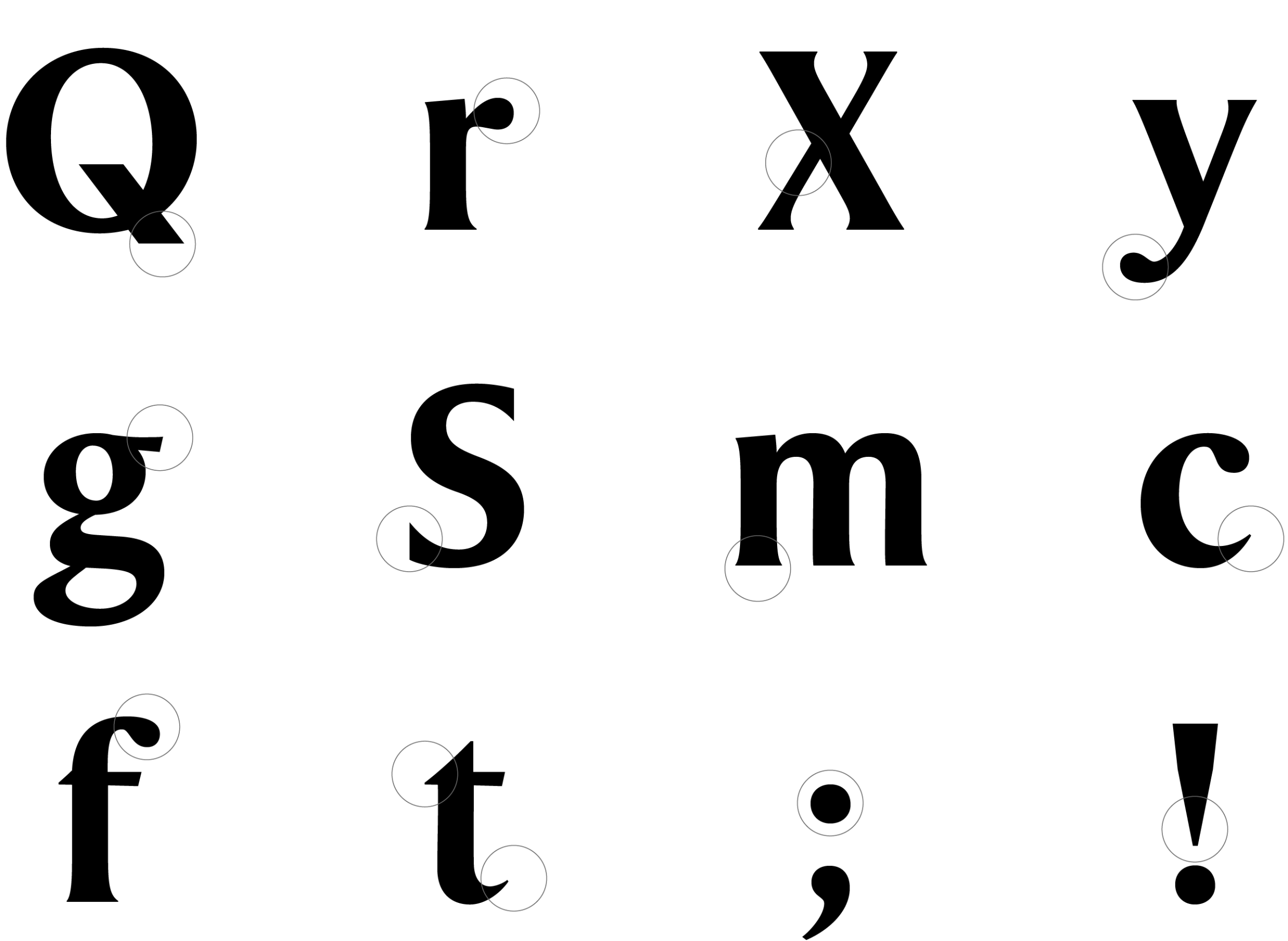
The symbols font, created in partnership with Dresser Johnson, is crafted with inspiration from Quad Signet and is built to be a functional complement to the larger graphic system.
The symbols font, created in partnership with Dresser Johnson, is crafted with inspiration from Quad Signet and is built to be a functional complement to the larger graphic system.


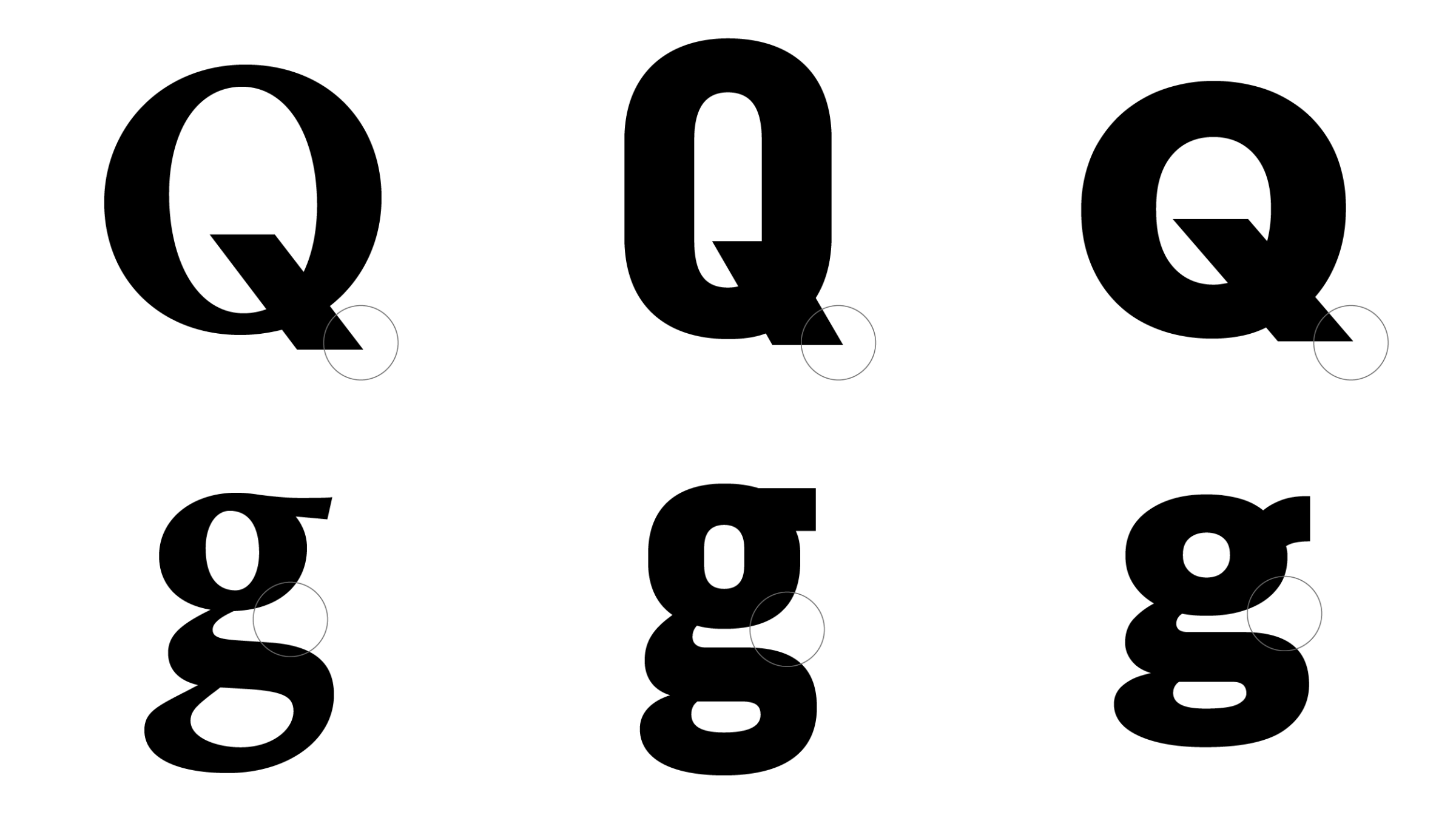
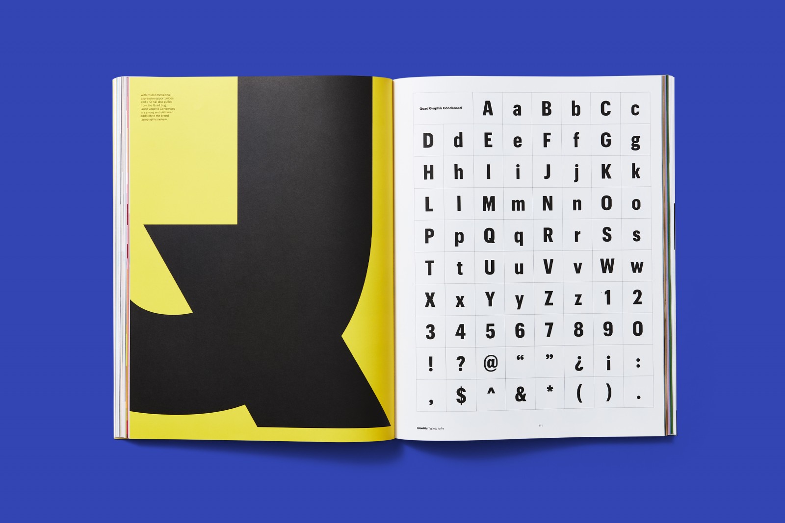
The supporting typefaces take all the same Bug-inspiration as Quad Signet and apply it to more industrial fonts.
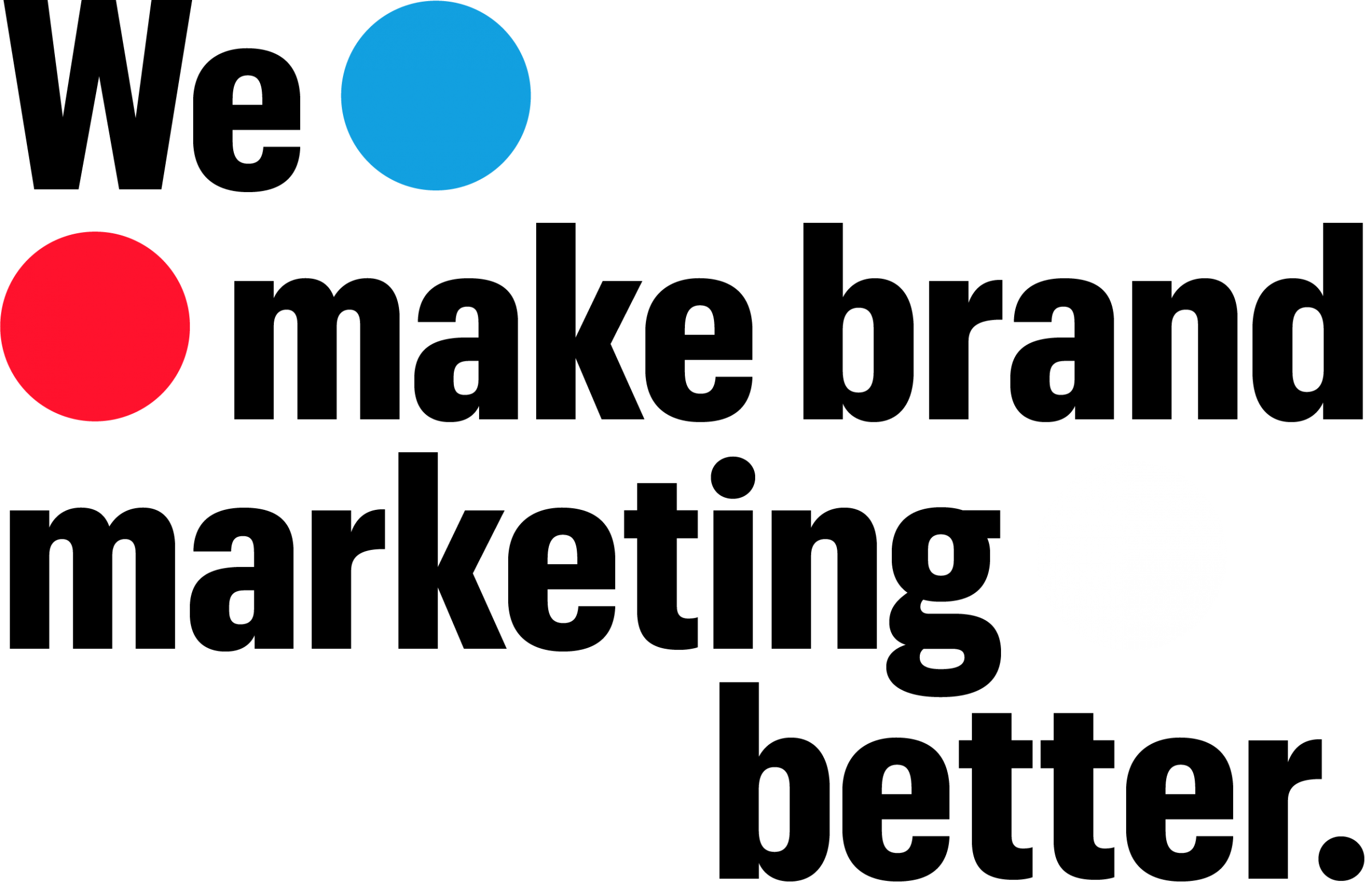
Quad Graphik Condensed and Quad Graphik Bold adopt the iconic Q tail. They also introduce a double-story “g” for improved readability and rounded punctuation to sync with the Quad Bug.


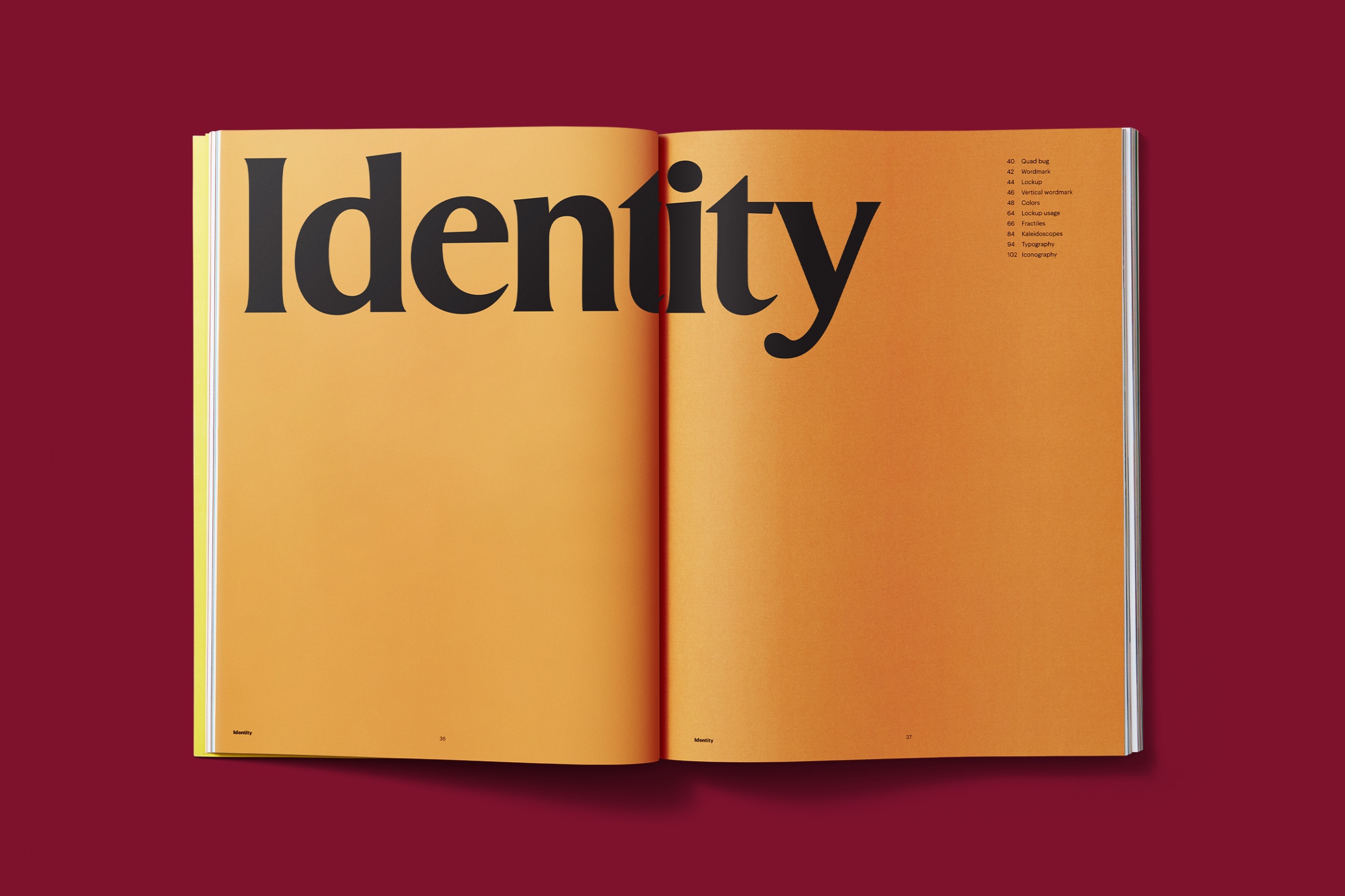
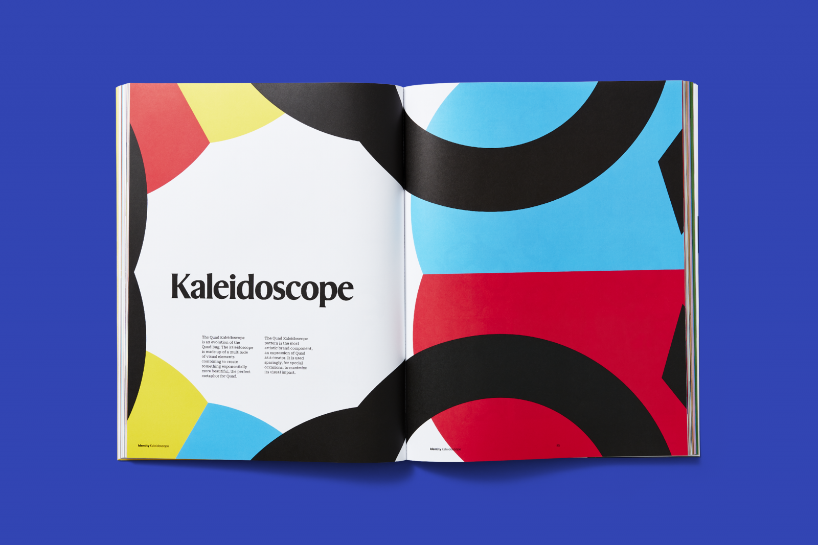
Brand book
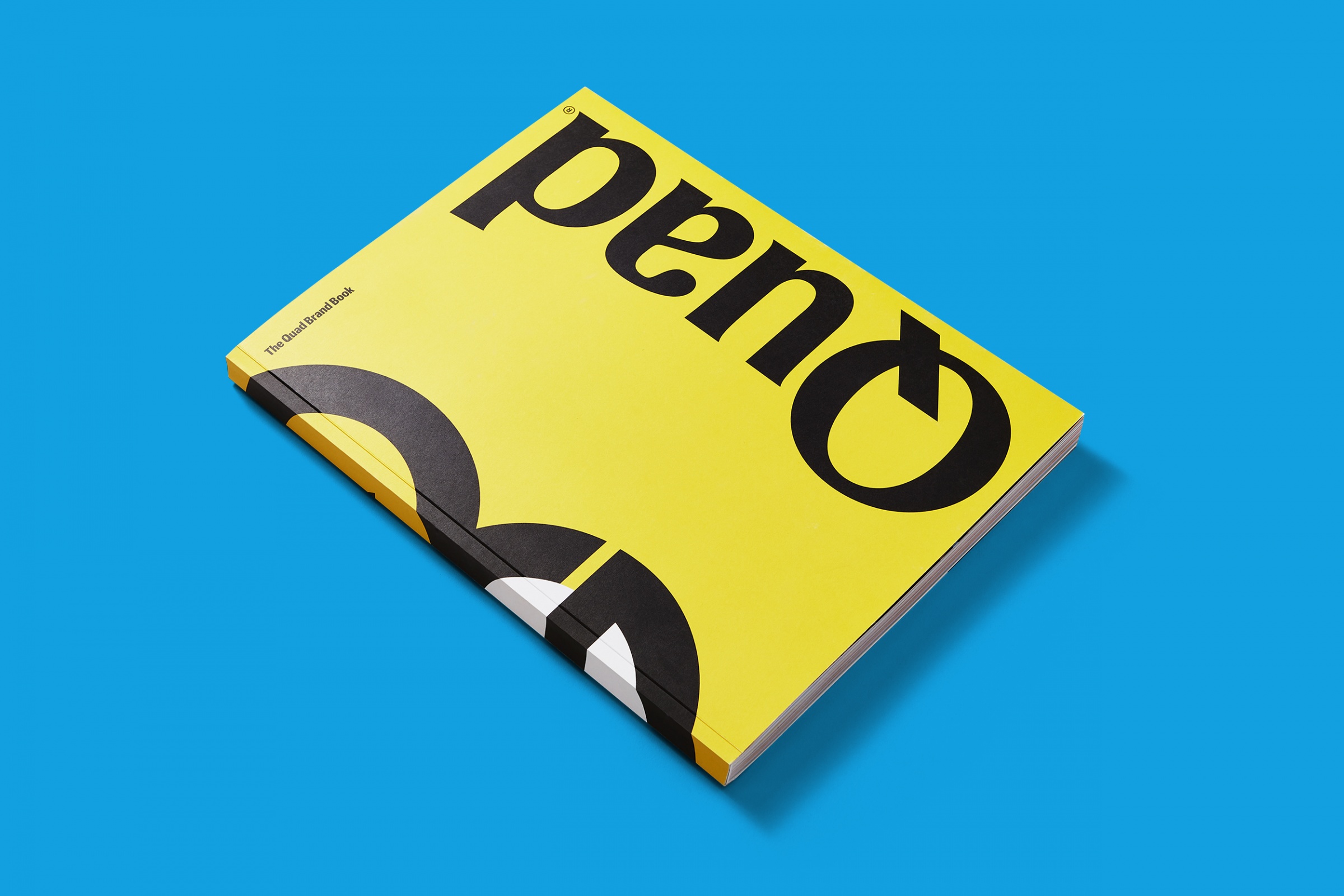
It’s not what you make, it’s what you stand for.
Jennifer Kinon
Partner, Champions Design
Michael McCaughley
Design Director
Carina Sandoval, Justine Olivia Marks
Strategists
Michael Penda, Amira Lin, Taylor Hale
Designers
Haley Kattner Allen
Project Manager
Commercial Type
Type Design
Kevin Dresser
Symbols Design
Quad Brand Marketing
In-house Design Team